Apeiron Branding
I crafted a new creative direction to elevate the brand presence of Apeiron, an established SaaS company, focusing on print mediums alongside digital. This initiative aimed to cohesively integrate and refresh the company’s various brands, ensuring a unified identity across all platforms.
Branding
I selected new brand iconography, color pallete and fonts to enhance audience engagement while maintaining consistency with Apeiron’s identity across print and digital mediums.
UI Design
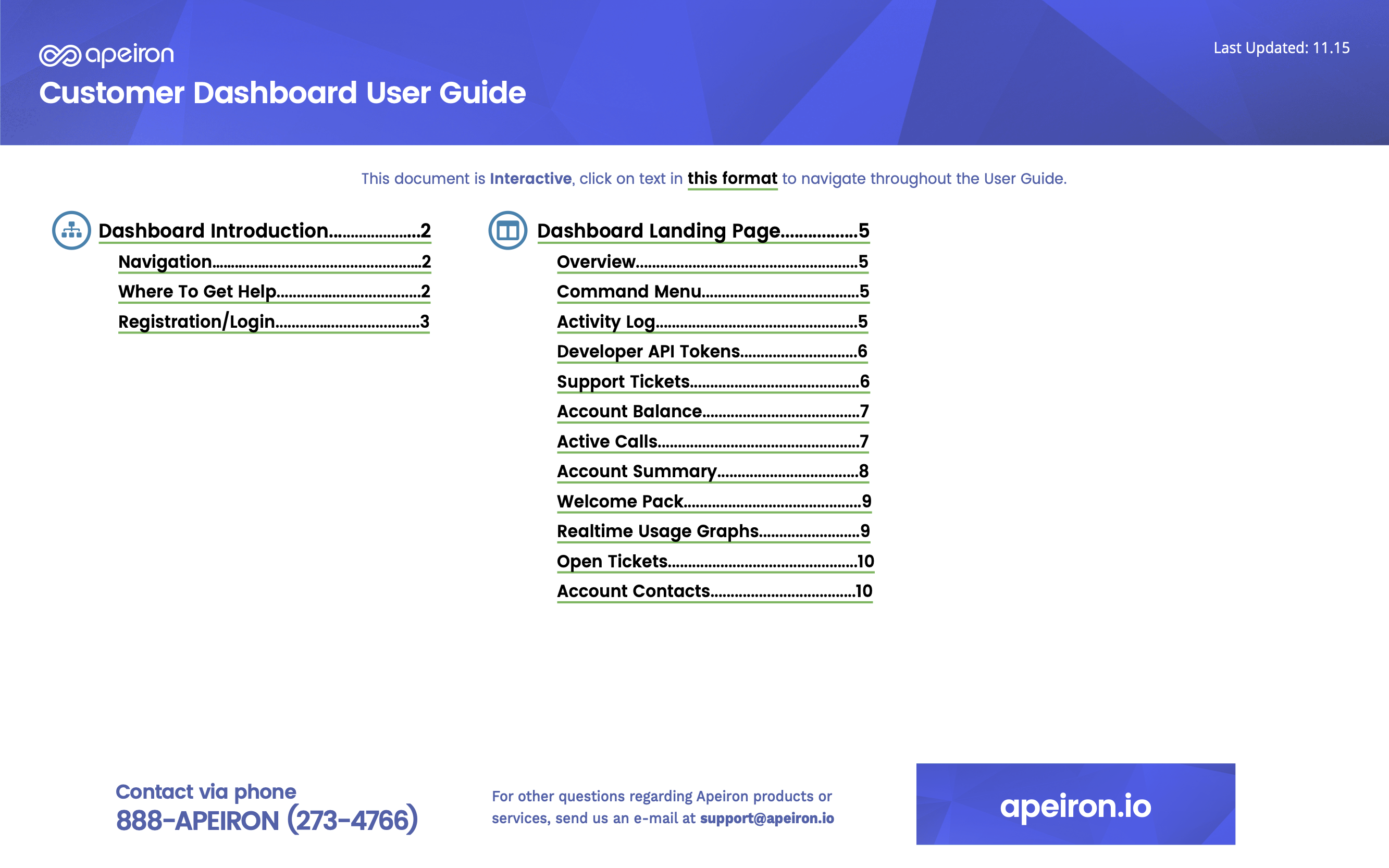
I worked closely with the development team to iterate on the enterprise UI for dashboard.apeiron.io and developed HTML/CSS templates for customer collateral PDFs.
Asset Management
I maintained a comprehensive repository of design assets and documents on Apeiron’s Design SharePoint and Jira boards to ensure consistency and ease of access.
Print Design
I addressed end-user and internal communication challenges by designing effective product marketing collateral, presentation decks, flow diagrams, and product packaging.
Apeiron needed new colors.
I started by selecting a new color palette that stood out more on print and digital.

New icons for a growing product offering.
Apeiron was updating its core product offerings, I designed a new icon set that helped communicate the purpose of each product via a simple icon that highlighted the core function of each product: SIP Trunking, SMS Messaging, POTS, Wireless Data, Router Backup, and Data Solutions.
For digital branding, but also safe for print.
Branding had to look good for print as well, this is one example of the new branding in PDF form.
New Product Collateral
With new colors, product icons, and a new font set, the final step was to incorporate the new brand guidelines into everything: web, print, social, and marketing collateral. These are some of the finished pieces:
The Apeiron brand is now SaaSier.
Apeiron’s brand recognition and engagement has now been elevated, solidifying their reputation as a leader in the SaaS industry with a cohesive and impactful visual identity.
